As more and more of our customers access Kobas from portable devices such as tablets and mobile phones it has become an increasing priority for us to improve usability on those devices. This is done by making our interface more touch friendly, supporting a wider array of web browsers, including those used on tablets and phones, and by improving the experience and layout at lower resolutions and on smaller screens.
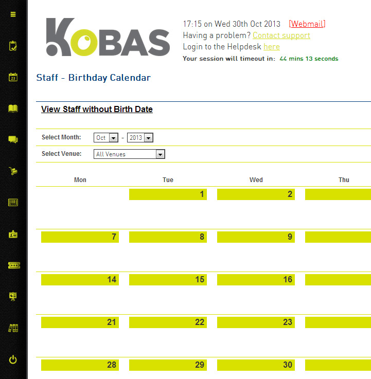
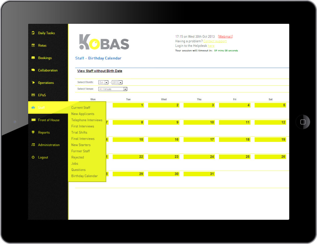
As part of our plan to introduce these improvements we will shortly be releasing a new and improved navigation. The new navigation will be easier to use, will shrink on smaller screens such as iPads, and most importantly paves the way for whole host of tweaks and enhancements to the Kobas user interface.
As you can see, the new navigation takes up much less space – especially in compact mode – giving you more screen real estate to go about your tasks in KOBAS.
Look for the new navigation in your Kobas account in the coming months.


